Brilliantly British
Duke Pubs
Branding, Rebranding, Brand Guidelines, Graphic Design, Copywriting, Marketing Strategy, Visual Identity
The Ask: The Dukes tasked us with a critical task: to refresh their brand while preserving the essence that has made them iconic. They needed a cohesive brand identity and guidelines that would resonate with their loyal customer base and attract new patrons, ensuring every element, from signage to social media, was on point.

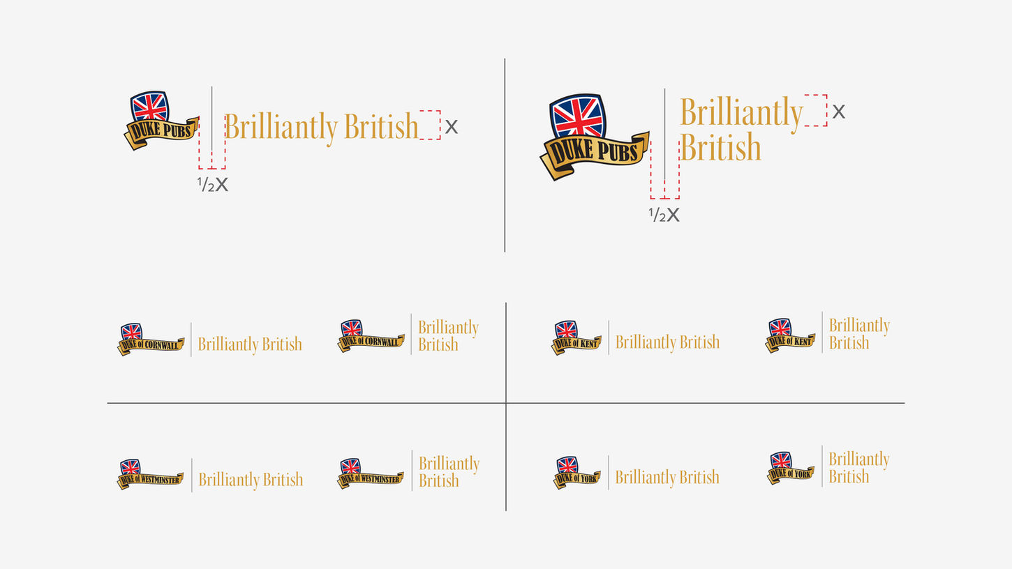
The Approach: Crafting a brand's playbook is akin to creating its DNA—every detail must be meticulously considered. We dove deep into The Dukes’ history, values, and customer experience to develop a set of brand guidelines that were not just rules but a blueprint for their entire identity. This included defining their colour palette, typography, voice, and visual elements, all intending to communicate the warmth, tradition, and modern flair that The Dukes embodies.
A brand without intent is like a car without a steering wheel. Our approach ensured that every touchpoint, from menu designs to digital presence, aligned with the new brand identity. We diligently created a versatile yet consistent look and feel that seamlessly translates across all mediums.

The Result: The rebranding for The Dukes was transformative. With a fresh, cohesive identity, The Dukes now boast a stronger presence in the competitive Toronto restaurant scene. The brand guidelines have provided a clear playbook, empowering their team to maintain consistency across all channels. This rebranding effort has solidified The Dukes’ position as an iconic establishment and enhanced customer recognition and loyalty.
We're thrilled to have been a part of this evolution and are always excited to jump into action whenever The Dukes are calling!


